Council moving forward with a refreshed new logo
Published on 23 August 2016
Council moving forward with a refreshed new logo
Gannawarra Shire Council’s 20 year corporate logo has received a refresh and will now be gradually implemented across the organisation and throughout the municipality.
Mayor Lorraine Learmonth says the previous logo has served the organisation well, but it was time for Council to move forward and refresh its corporate brand and continue to grow and change positively.
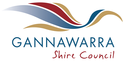
The refreshed logo sees a variation in the corporate colours that represents our landscape and region. The blue/green represents water and growth, the terracotta is to represent the red soils of the Mallee and the addition of an earthy brown/mustard/ochre colour that represents the dry native landscapes, the forest floor and the earthy colours around the rivers and wetlands.
"This refresh of the logo will modernise Council’s identity while still providing a clear visual link to the existing brand maintaining the key components and colours that represent our landscape and region."
"The logo has been designed to respect the integrity of the iconic ibis, while providing a refreshed image and identity, reflective of Council’s modern and professional approach", Cr Learmonth added.
Community members will see the logo implemented gradually, with the initial impact being on Council’s electronic platforms such as Facebook, Twitter and website.
Additional implementation will occur only as existing stock or assets require replacing or updating, such as envelopes and other stationary right through to signage.
After 20 years, a refreshed new-look logo and the associated branding designs and developments will provide a new energy and impetus for Council.
…ENDS…
Date: 23 August 2016
Media contact: Katrina Thorne T. 03 5450 9333 M. 0409 616 627